

Sushi City is a sushi restaurant located in the center of Spanish city of Alicante and offers its visitors a huge selection of sushi and rolls of various types, from world-famous (California, Filadelfia) to special ones created by the restaurant itself (Sushi Burger, Poke Bowl).
The task of our team was to design flyers for this restaurant. The main wish of the customer was that the design should be made in harmonious colours, and the flyers themselves should display a collection of dishes that a visitor can order in a restaurant.


After a few days of work, the «Progress Motion» team provided the customer with two types of flyer designs to choose from. Both designs are double-sided and feature a color scheme of yellow and red.
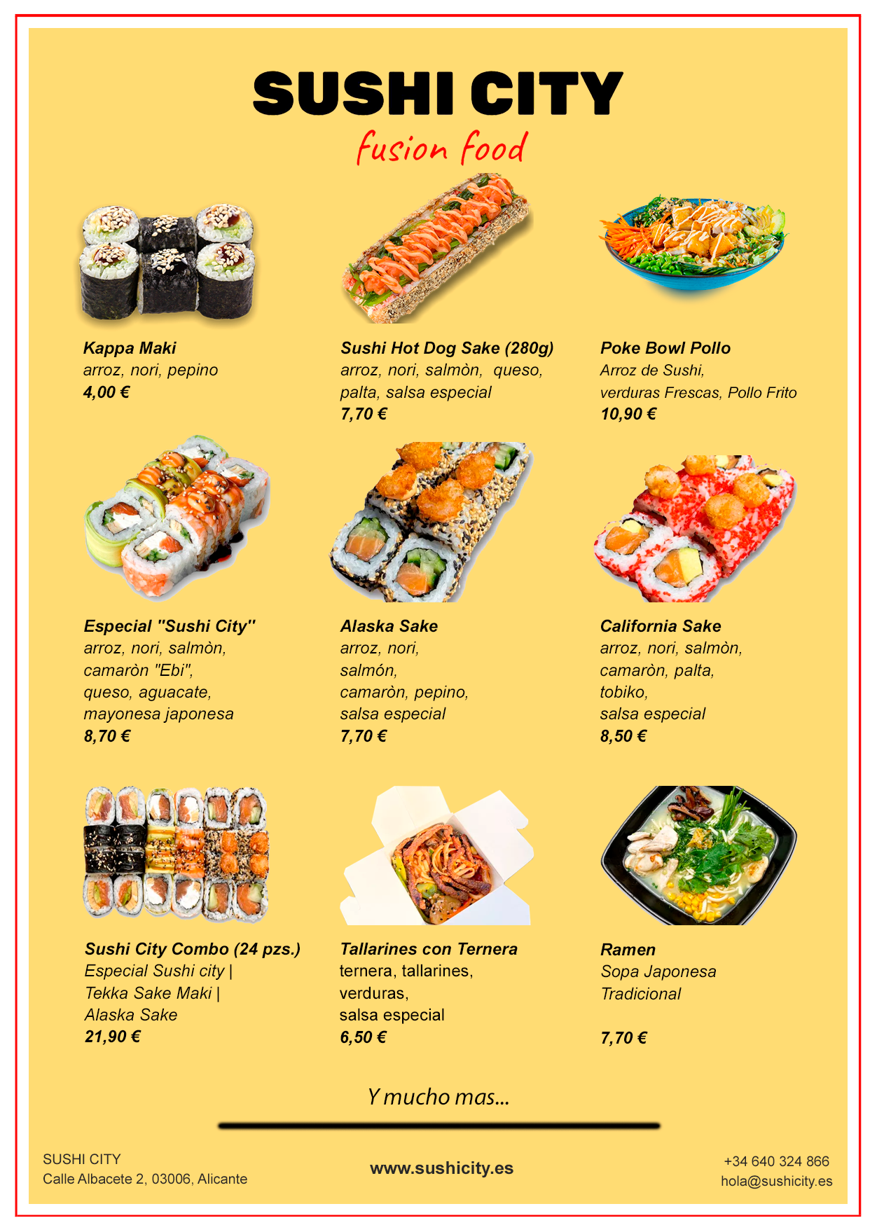
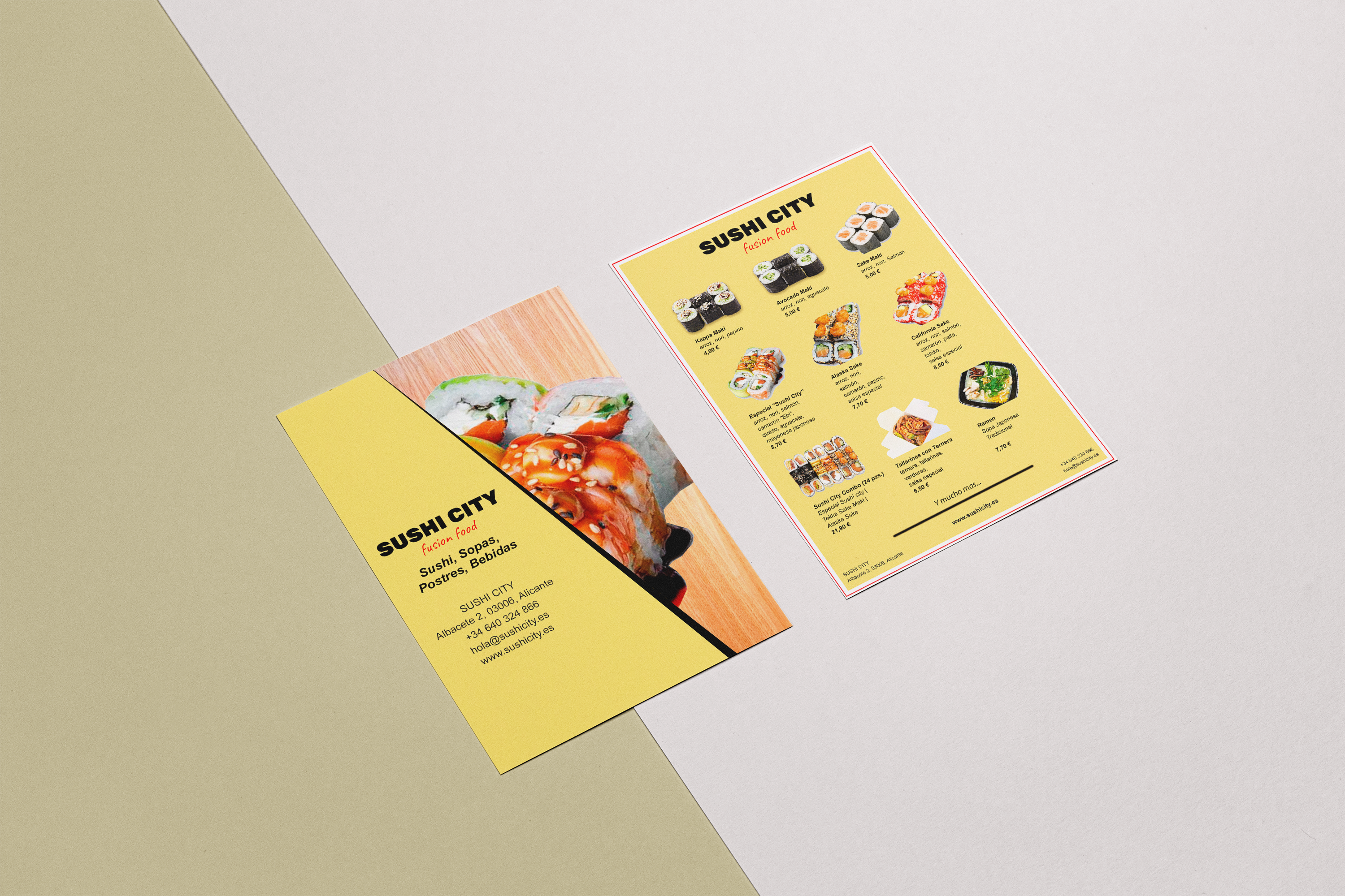
* The front side of the first type is occupied by a photo of one of the restaurant's rolls, dividing the flyer in half, the second part of the front side is occupied by the name of the restaurant with the address, mail and phone number. The back of the flyer is occupied by 3 rows of different dishes with the ingredients of the dishes and contact details of the restaurant at the bottom.
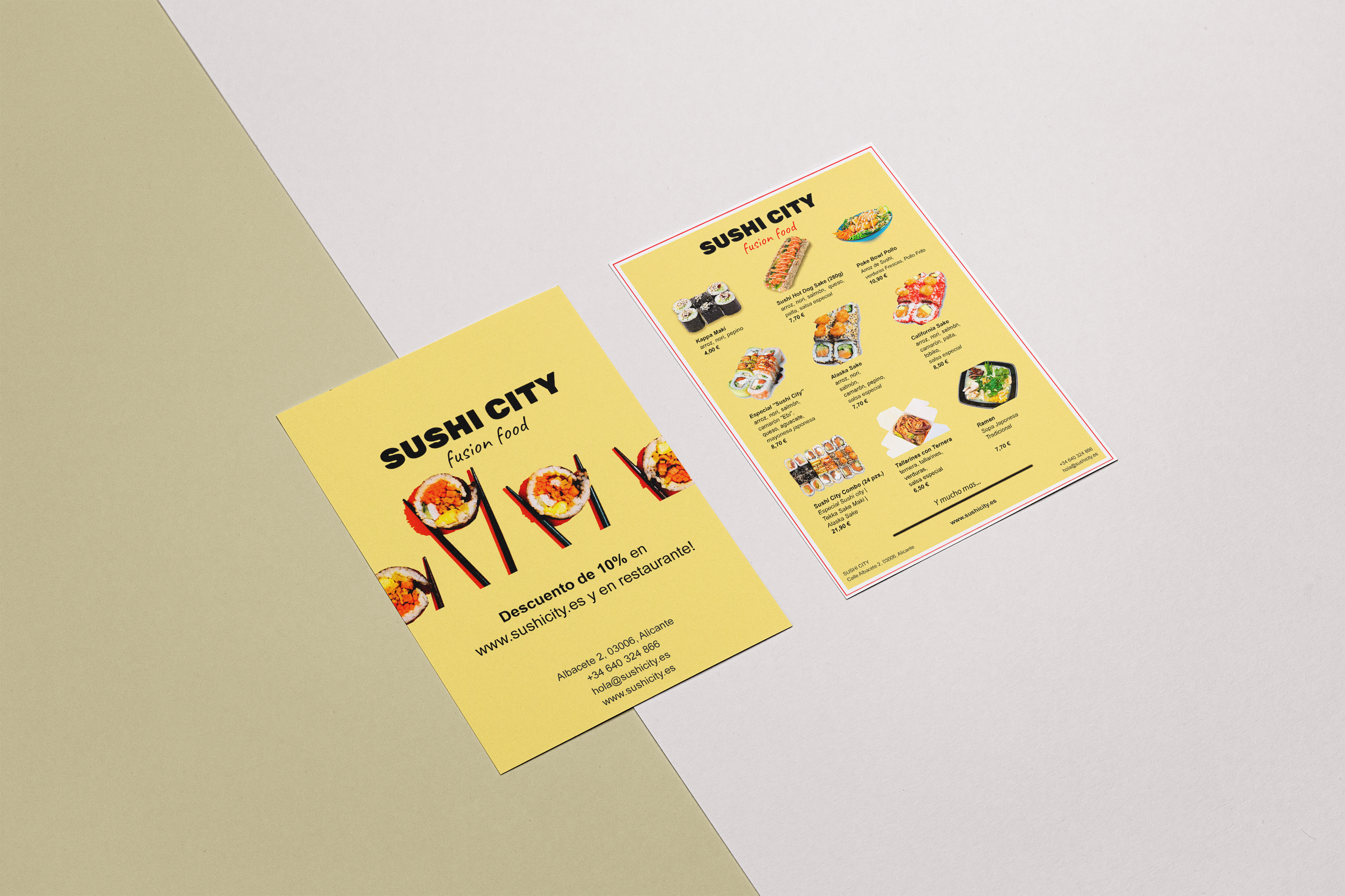
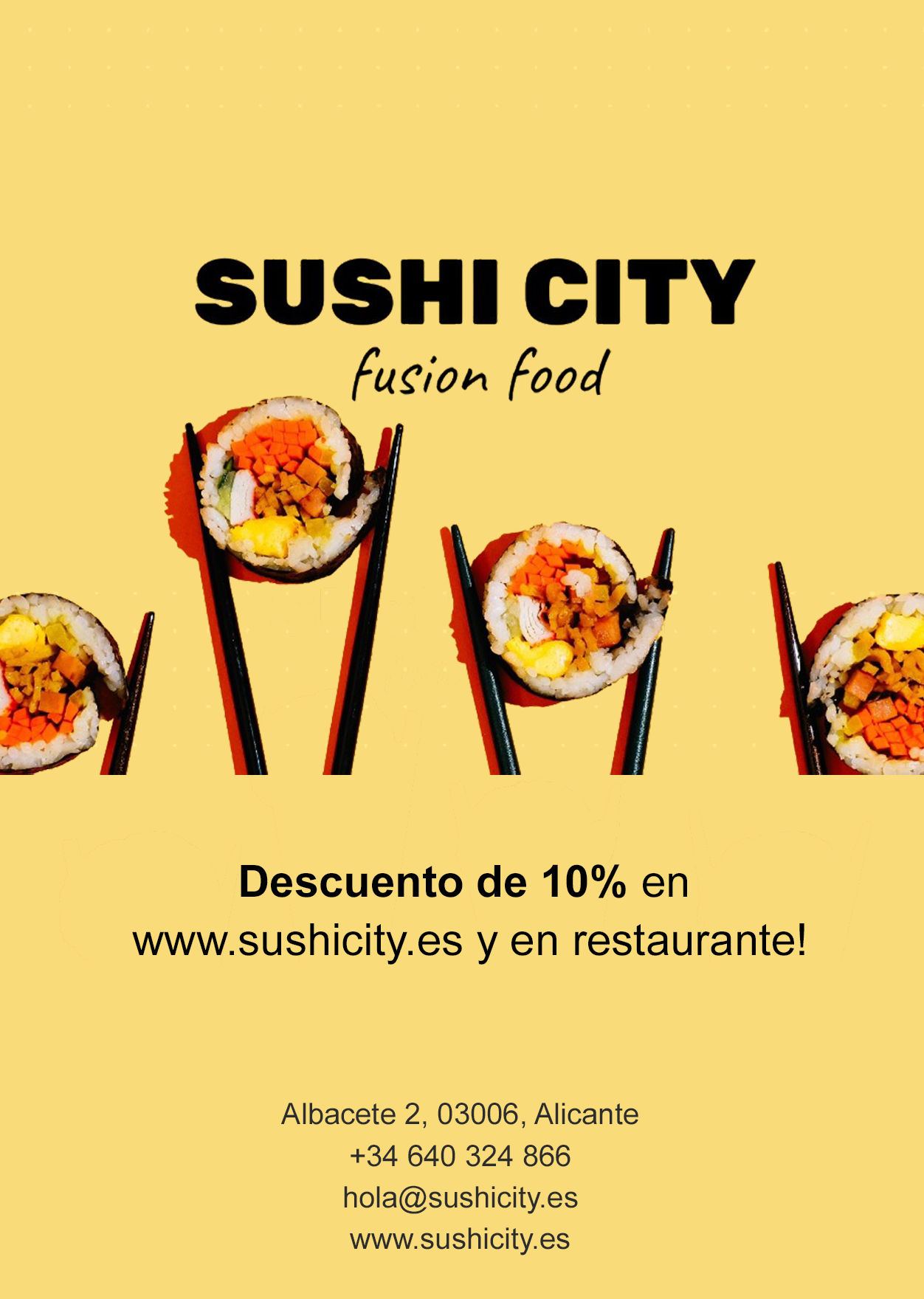
* The second type of the flyer is made in the most simple style. The front side of the flyer is occupied by the restaurant logo, contact details, as well as information about the discount being presented. On the reverse side, as well as in the first version, there are 3 rows of restaurant dishes with their ingredients and contact details of the restaurant.
As a result, the customer chose the second design (on the top-page photo) option and was completely satisfied with the work of the team «Progress Motion Digital & Web».
