

Mobile has taken over the world. More than a half. According to wearesocial.com in 2020 53.3% of Internet connections were made from mobile phones and 44% from PCs. Moreover, people not only use mobile applications adapted for small screens, but also open various Internet pages. Looking for information. Choose anything. Make orders. Make purchases.
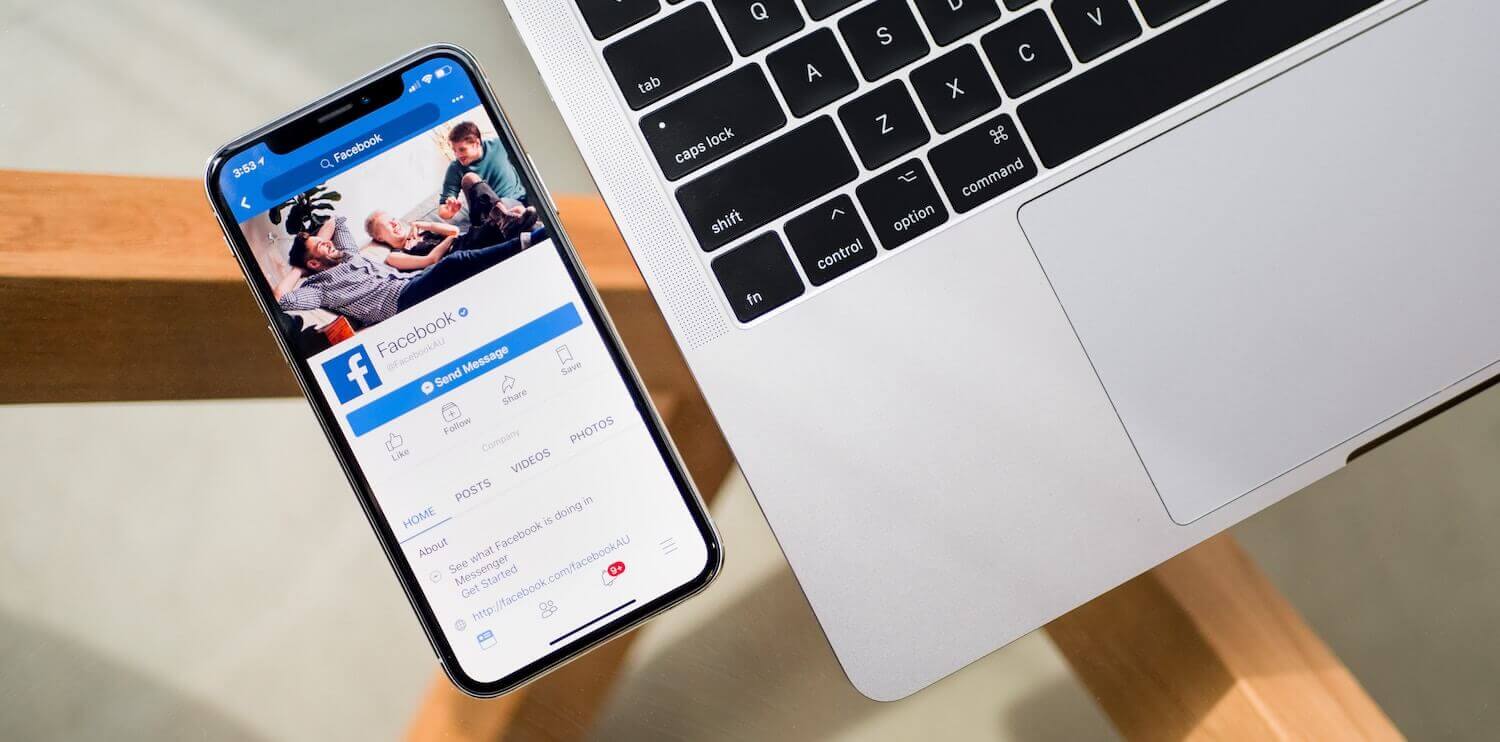
It is much easier for a person to take a mobile phone and access the Internet from it than to turn on a computer. Moreover, one will do it if there is a mobile site where the interface is intuitive. Also add omnichannel to that. And your social networks (89% of visits are made from smartphones), where you can collect leads, warm up the audience for a purchase. And immediately make them do it.
When creating a website, it is very important to create a mobile version of it as well. Moreover, this version should be adapted both for small vertically elongated screens, and for the peculiarities of use (thumb activity). By the way, it is often better to start with the mobile version of the site, and then make the desktop one. So you will be able to outline the main thing, which will then be supplemented by the PC version.
Here are 4 important things to keep in mind when creating a mobile version of your website.
1. Adaptation for thumb and small screen
Scrolling, swiping, clicks, typing - we mostly do this with our thumbs. Doctors even have the term "smartphone thumb" when patients complain of pulling pains in the hand, so actively we can use smartphones. When designing mobile versions of something, it is important to pay great attention to the style of use of the device, and take this into account when working out the UX / UI. The arrangement of the blocks should be logical and intuitive for the user.
It's also important to pay attention to the size of your users' screens. The site should adapt to most popular smartphone screen sizes. Pictures, if they are the same in both mobile and desktop versions, may differ in size, orientation, width, depending on the width of the device's screen, but still reflect the main idea. The buttons should be done so that a person's finger can “hit” it specifically, and not the neighboring one, and without any problems. Recommended sizes are between 42 and 72 pixels.
2. Minimum of text
Not all users have the screen size of their smartphone so large that it can display a large amount of text. And so that this text is easy to read. Reduce all information as much as possible.
Also, the small size of the screen will not allow you to insert many active buttons on one page. Here we mean the sections of the menu. Therefore, it is necessary to think over the navigation so that the user does not get lost in the abundance of options, it is clear to him where he will go when he clicks on a certain button, and what he will see there. A huge section of the menu is definitely not needed here. Make subsections. But don't get carried away.
Also, remember how the menu icon is usually shown to you. These are three stripes in the upper corner of the site. Users are already used to them. And to this location.
3. Site size
Beautiful animation, variety of fonts, colors, photos, videos. All of this has its own weight. And the mobile Internet is not always able to download this quickly. Five seconds of waiting for one page to load, and the user no longer wants to wait. And refuses to visit the site. Therefore, in mobile it is better to be minimalist. And clearly know what each page is intended for and what it should lead the user to as a result. Well, remember about the depth of the pages. Not everyone will scroll far down.
4. Data entry
You can have many goals for your site : collect contacts, inform, lead to a purchase. Surely there will be a fill-in form on the user's path. At least his phone number for communication. Since it is important for us that the client fills in these fields, it is also important that the filling process is convenient for the client. The currently required forms are displayed. They are convenient in size so that you can click on the desired one. The input field is viewed when entering data and does not disappear under the keyboard so that the user can re-read what she\he is entering.
Also, setting up the autocomplete, integration with the profile of Apple, Google, Facebook, Yandex, with payment systems - all these instruments will simplify the process of entering data by the user, less annoying, and, reduce the desire to stop filling out the form because of inconvenience. And do the action that your site was leading to. If it is impossible to enter such a system, then make it so that the user can save the entered data and during the next filling of the form can immediately use the saved template.
Need a digital business solution? Contact us!